Member-only story
The different types of messages UXers need to remember to design
Consider this scenario: a UX designer has finished design and has a kick-off with developers. It looks good, and nothing is obviously missing, so they start implementing it. During development, questions are raised — what happens if the user goes off the happy path? What success message should be displayed to a user to give them feedback that an action was successful? How do we communicate to users the system state if something has gone wrong? How do we help them recover from an error? Hopefully, developers will reach out and work with the designer (or UX copywriter) to craft these messages. In the worst case, they write the copy themselves and confusing messages may make it out into the wild.
When interacting with your system, your users will come across many different types of messages. You need to craft these carefully to communicate meaning and improve the user experience, not to mention usability, of your system. I previously wrote about bad error messages, but there are other types of messages you need to consider — this post outlines 5 types you need to remember to design for.
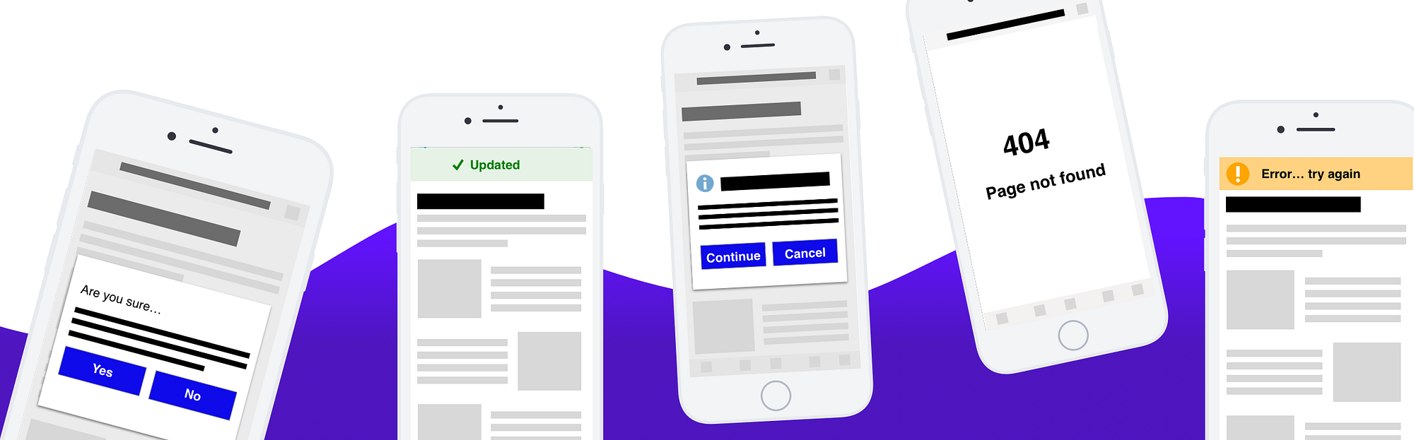
5 types of messages you need to remember to design
- Confirmation messages
- Success messages
- Warning messages
- Error messages
- System messages
Confirmation messages
These are messages which require users to confirm an action they are trying to perform. When a user performs an update action there is generally no need to display a confirmation message (unless it is a breaking change), but you would display them when they are:
- Deleting an item (e.g. Are you sure you want to delete? )
- Attempting to exit a screen with unsaved changes (e.g. Do you wish to save changes?)

Use this type of message only to communicate information that users must confirm before the action is completed. Use sparingly as to not slow down the intended action with unnecessary…